
Inertia Branding
Branding and Identity Design
Mission
University Project
Project Type
Gaming Enthuiasts
Target Audience
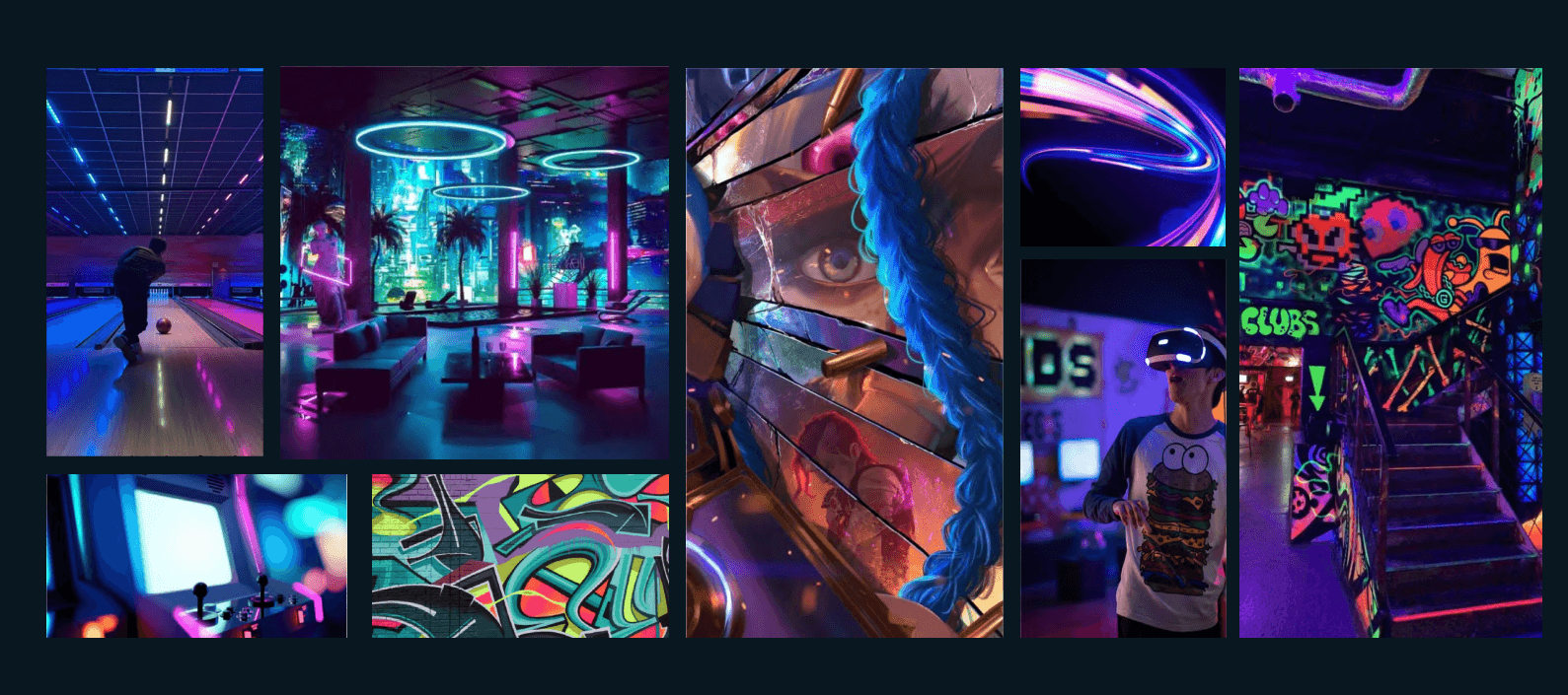
What is Inertia?
Inertia is a gaming zone, that focuses on providing a high-energy and immersive gaming experience for players. The zone features a wide variety of games that challenge players to maintain their focus and reaction time, ranging from classic retro games to the latest VR titles offering a unique blend of traditional and modern gaming options.
Tone of Voice
Energetic &
Immersive
Playful &
Aggressive
Swift &
Spontaneous
Competitive &
Intimidating
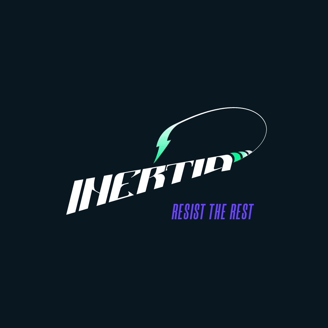
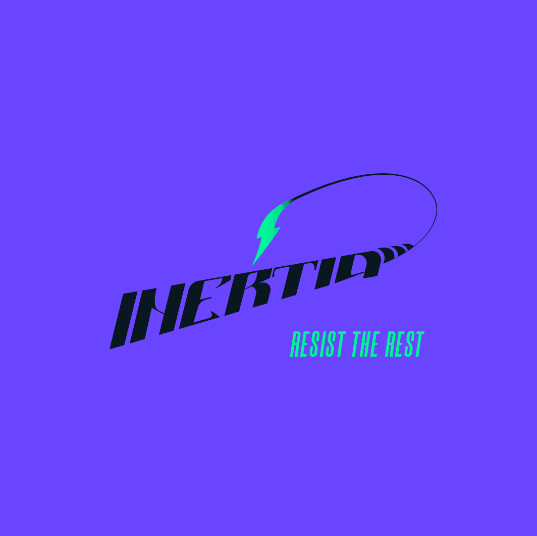
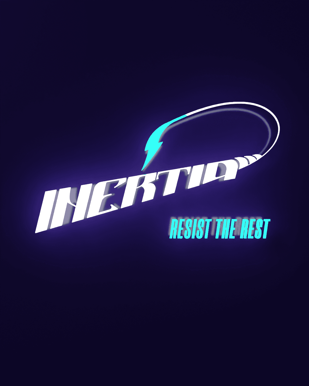
In order to position Inertia as an exciting gaming arcade, the brand identity had to be different, striking and young. I create the visual style based on three key elements: the logo, the colours and the typography.
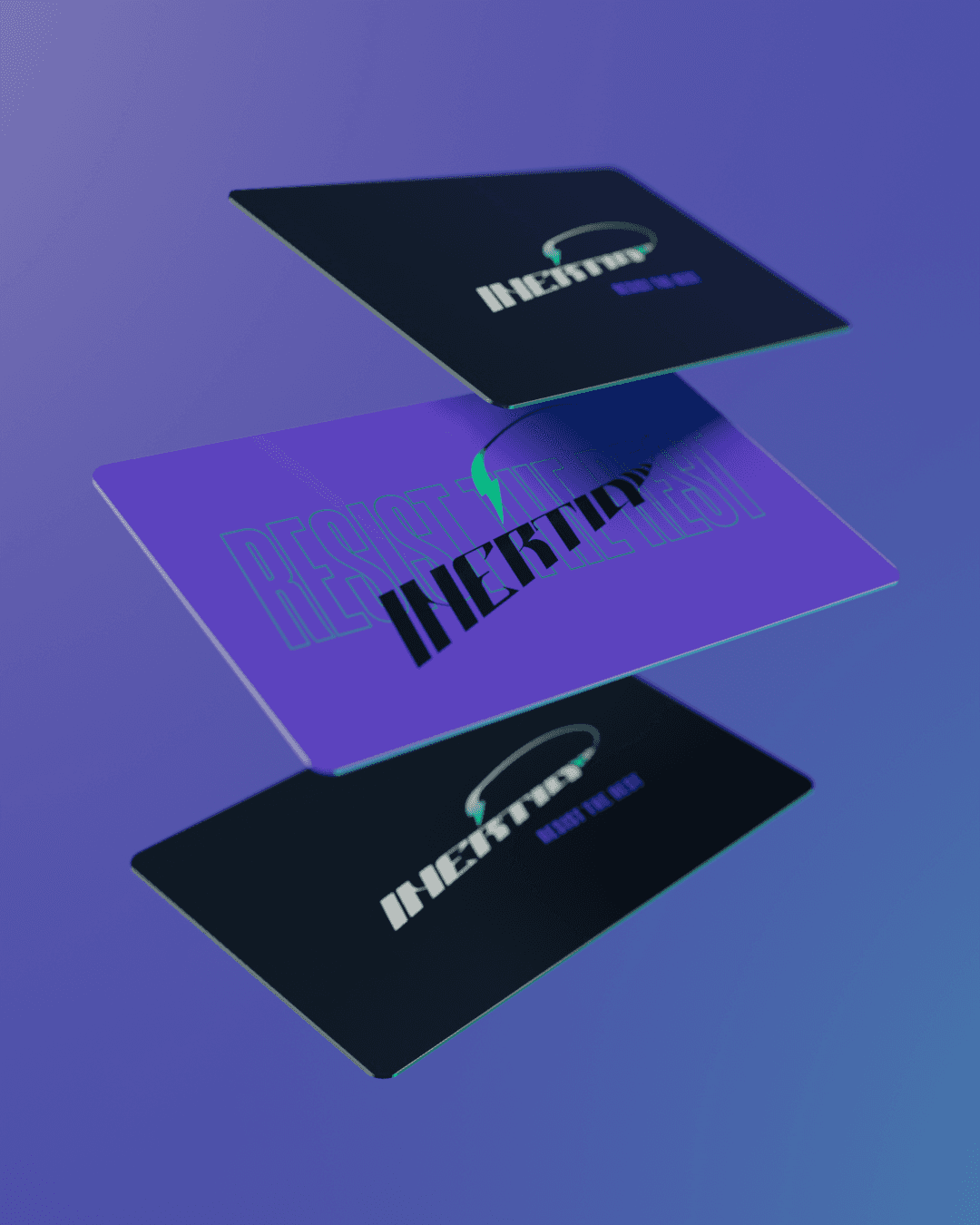
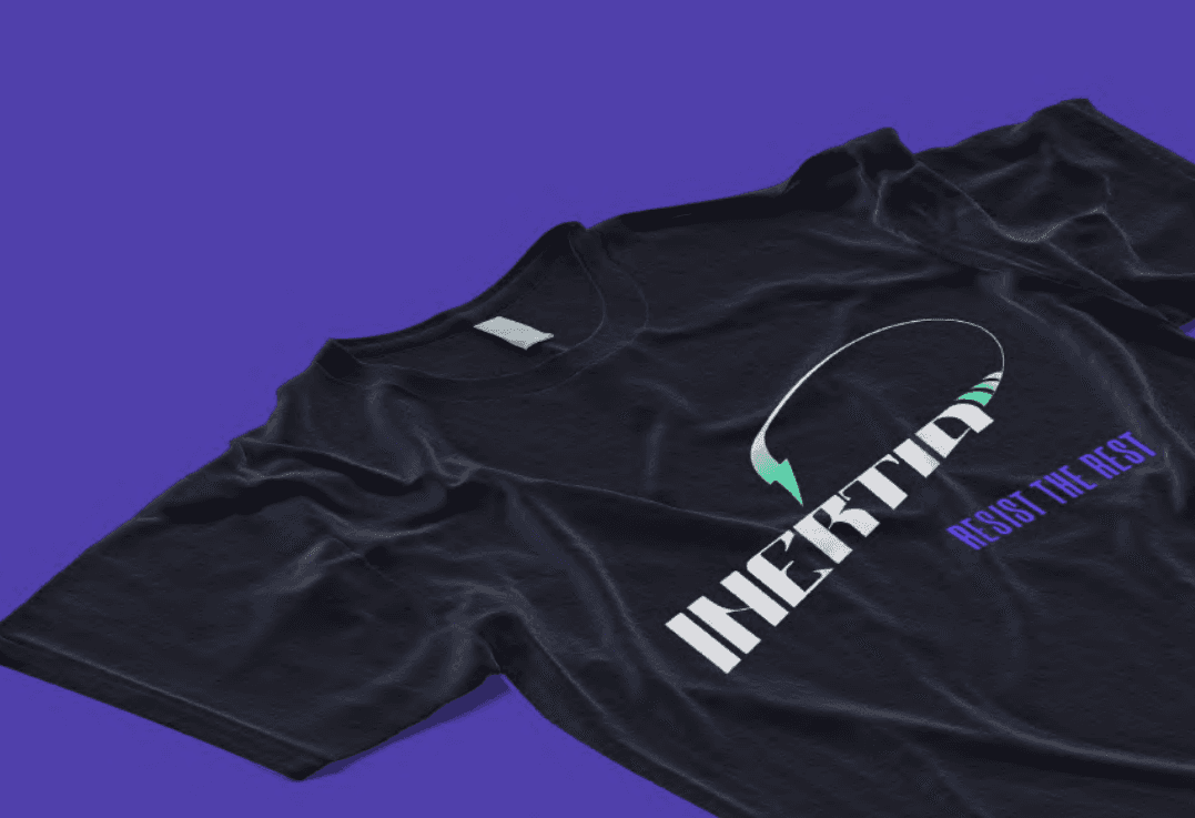
Visual Identity

The logo of Inertia is a bold and energetic representation of the brand in a form inspired from a Scorpion to give it the striking appeal.
The Logo
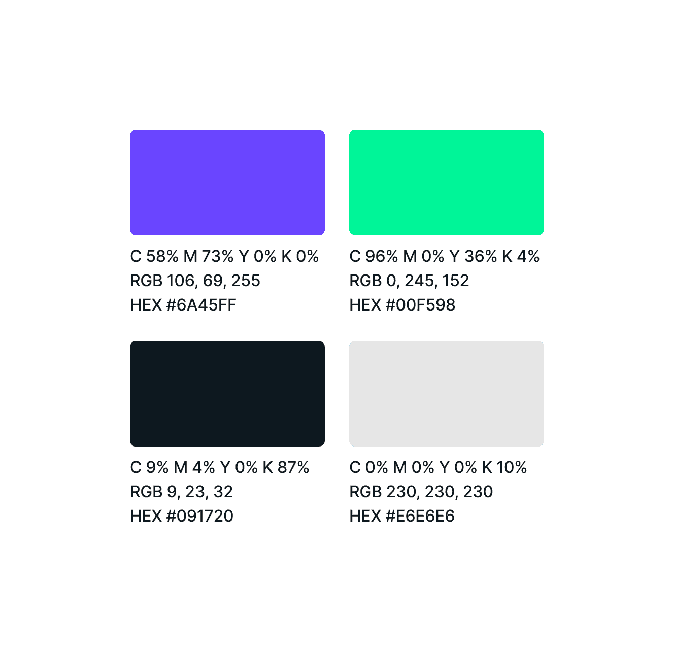
The colors of Inertia form a perfect combination of speed and energy inducing an immersive and competitive spirit in the players providing good contrast throughout the design elements.
Colors
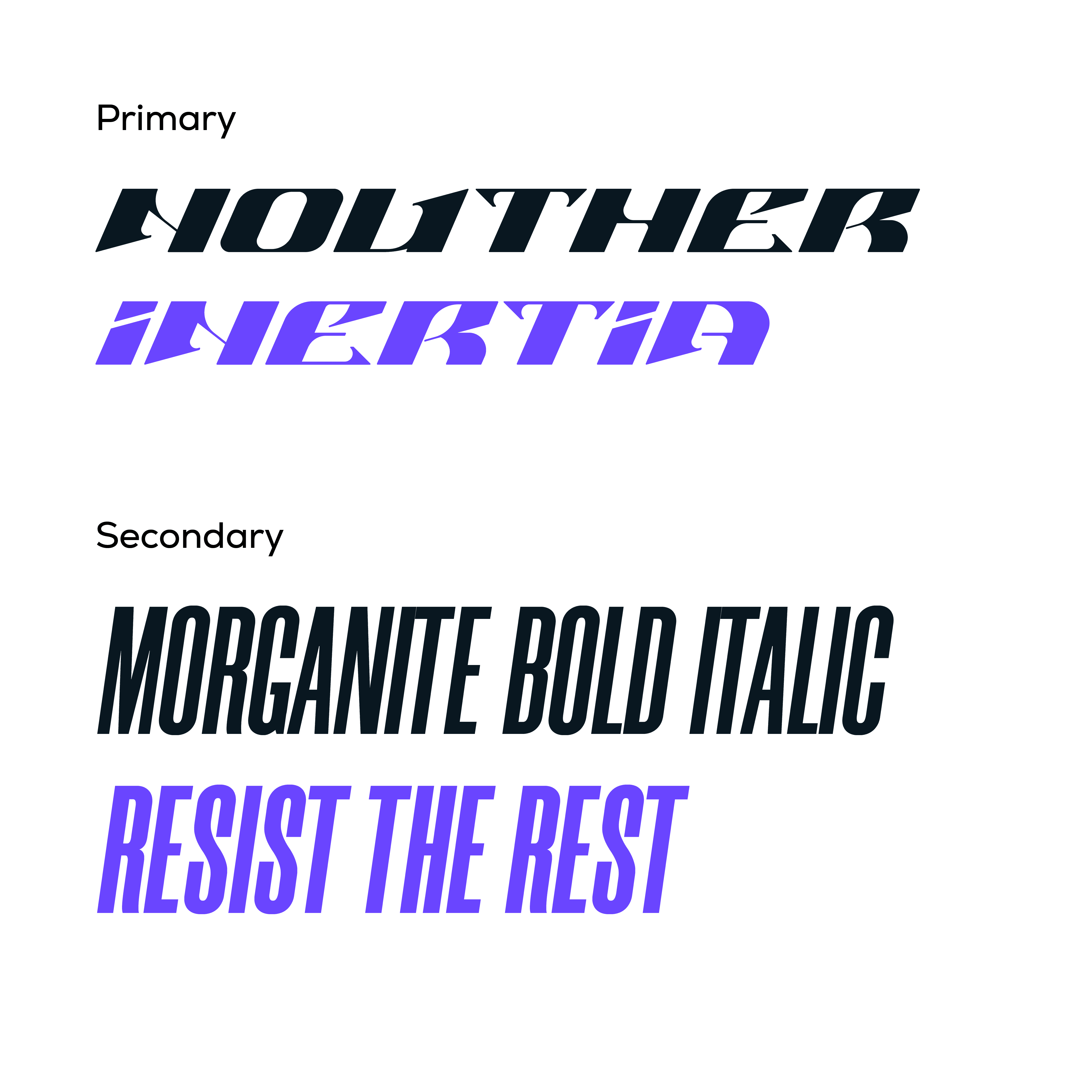
The Inertia logo uses a modified version of the Nouther Typeface.
Morganite is the secondary Display font also used in the tagline.
Typography
View Other Projects


