
Jessot Group Branding
Branding and Identity Design
Mission
Personal Project
Project Type
Businesses, New Professional
Talent
Target Audience

Jessot Limited is a listed company that has global businesses in various geographies.(Zambia,Singapore, Germany, India) It is a 50 year old company that has spread its wings globally and hasbuilt considerable equity in the businesses they are engaged in.
Tone of Voice
We are quick to make
decisions and are not
afraid to take risks.
We are able to adapt
to changing
circumstances and are
comfortable
navigating through
uncertainty.
AGILITY
We have a strong drive
to succeed and are
constantly seeking out
new opportunities for
growth and
advancement.
GROWTH
The way we express
ourselves is forthright
and open, never vague
or unclear. Honesty
builds trust and a sense
of safety, which paves
the way for constructive
dialogue and great
relations.
TRUST
We are leaders in the
market. Without ever
being arrogant, we know
our worth and our
strengths. This is
reflected in how we
speak and write – with
self-assurance, pride
and determination.
CONFIDENCE
They want to change their current mark completely, though they would like to retain the five stars in some manner so as to not shake up sensitivities of the older generation.
Previous Logo
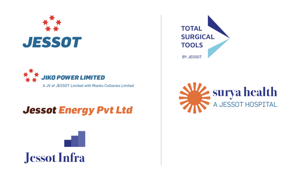

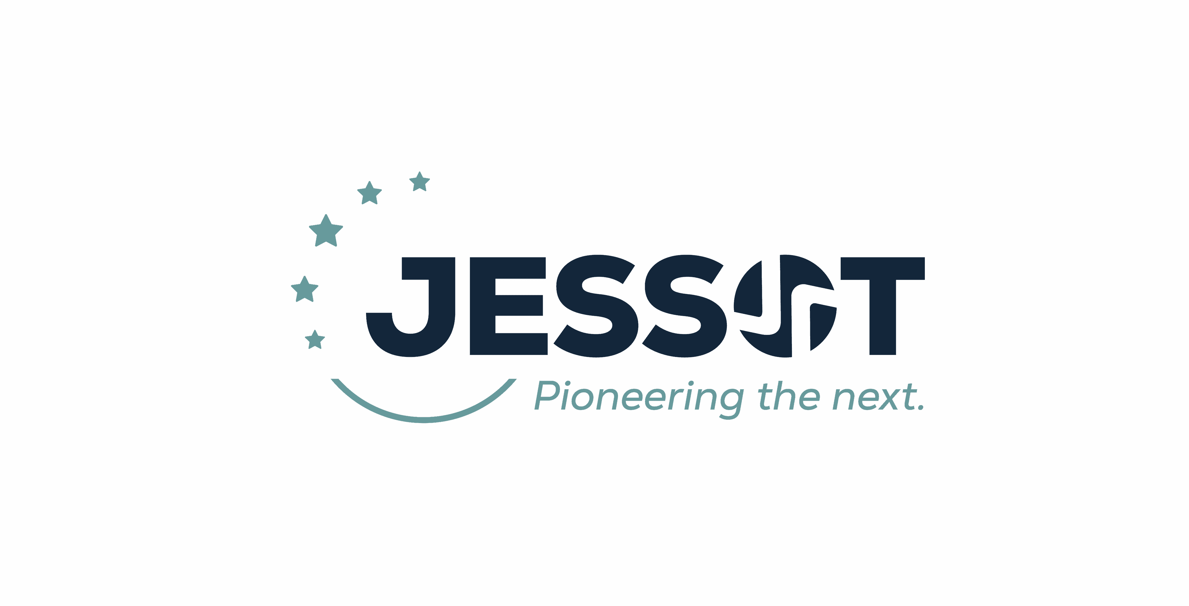
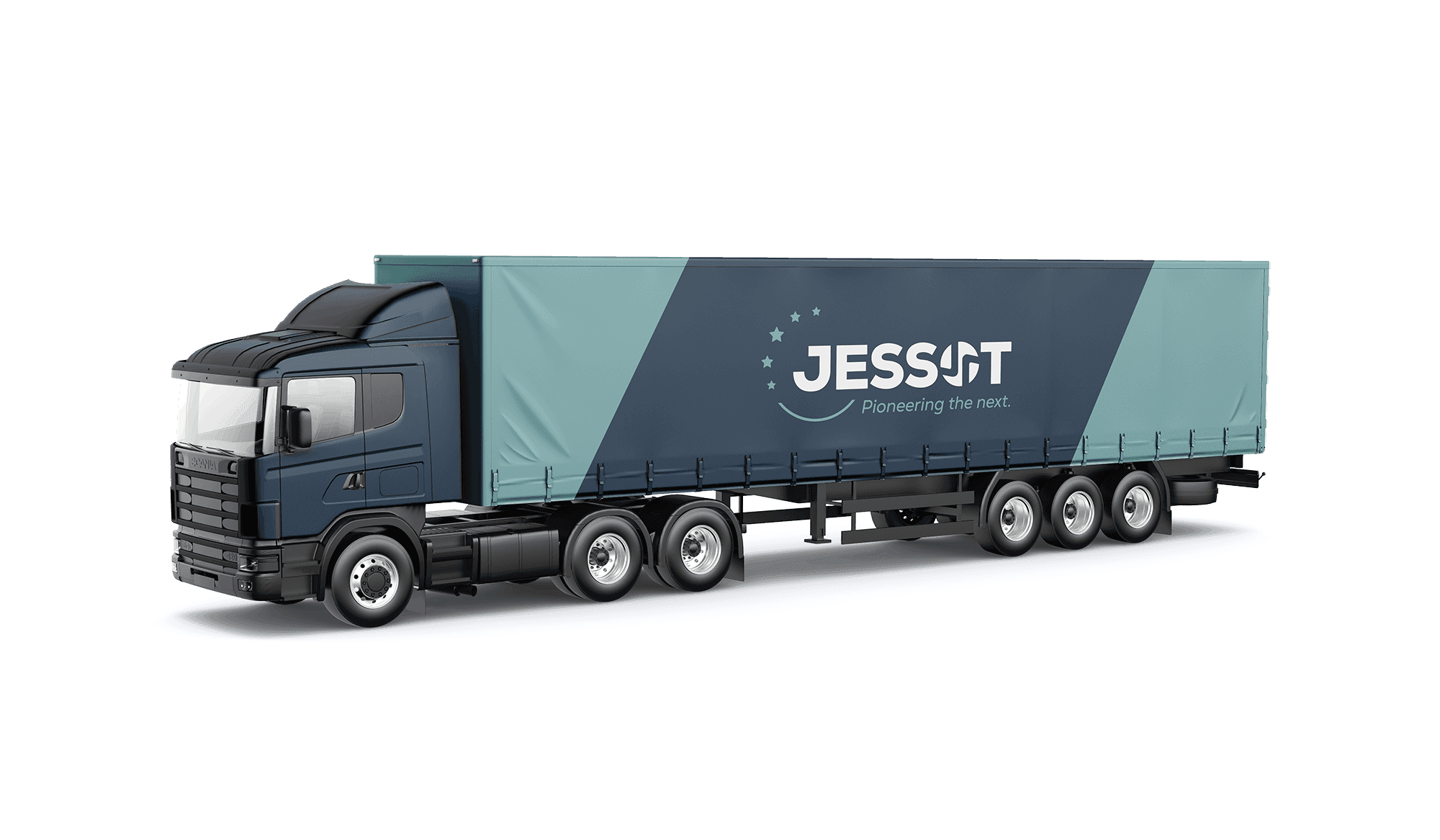
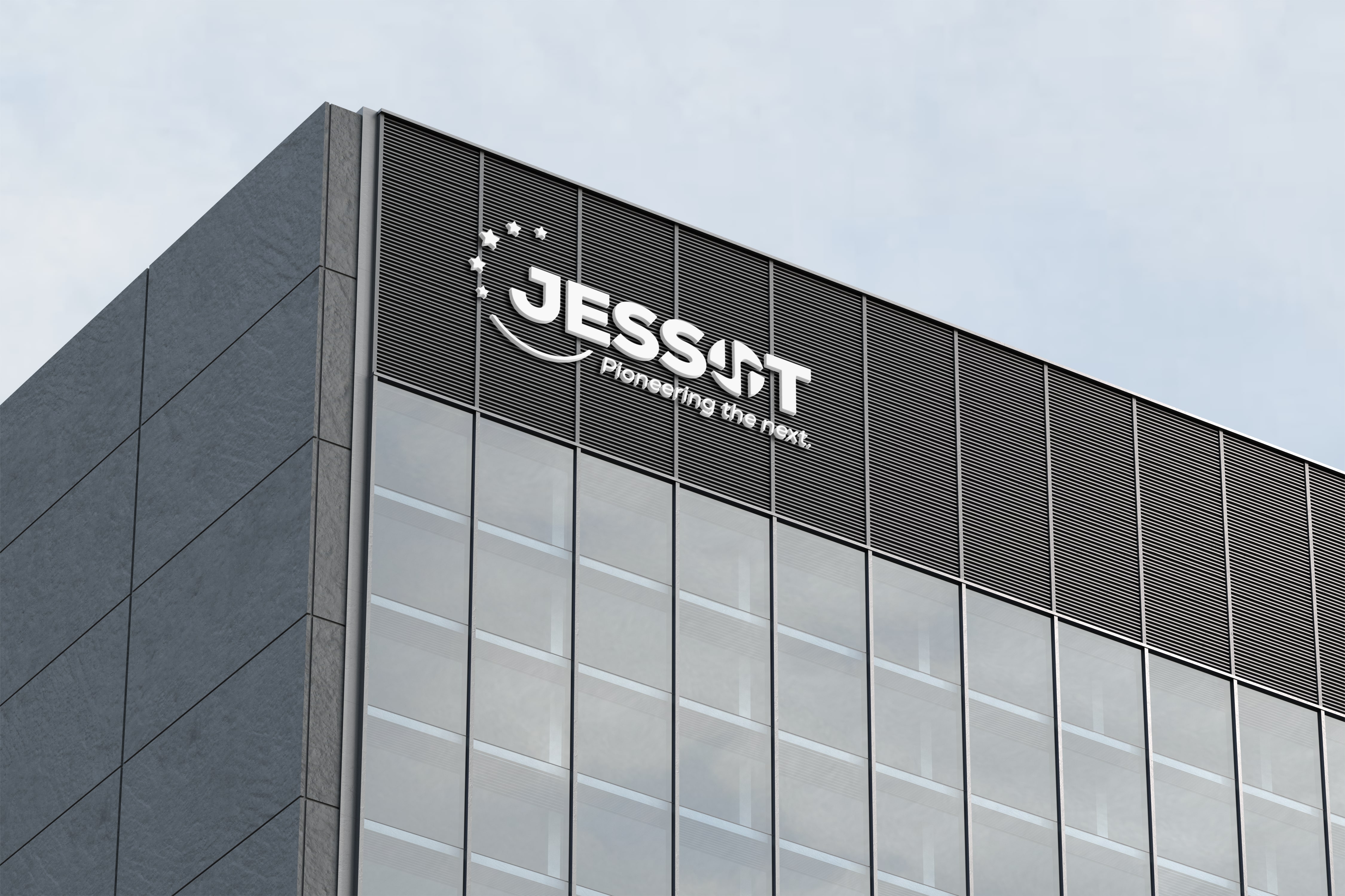
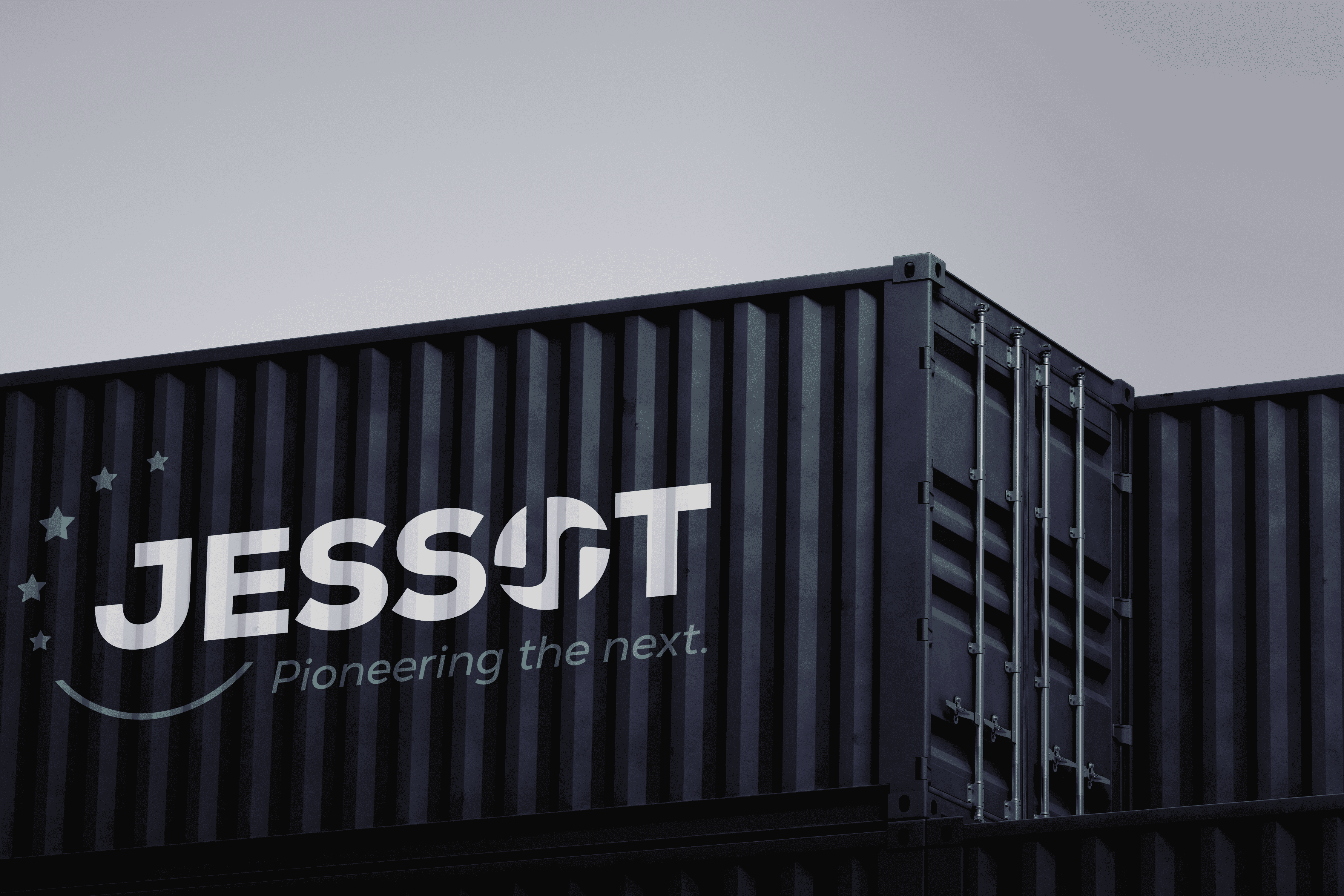
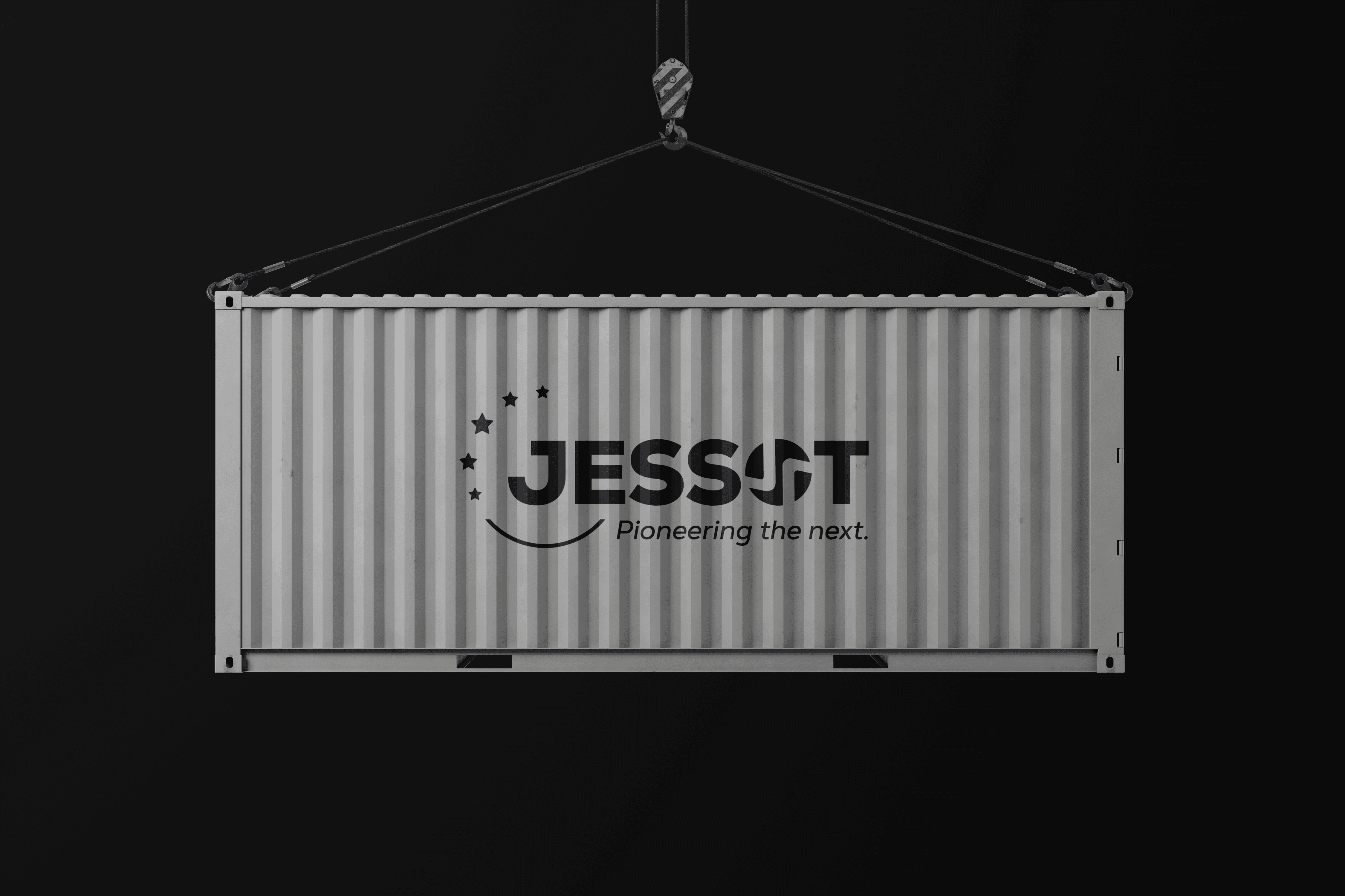
The wordmark – JESSOT – is the most direct and effective asset in communicating the brand. It is an important graphic identifier of the brand identity. It must always be treated with care and respect to maintain its value.
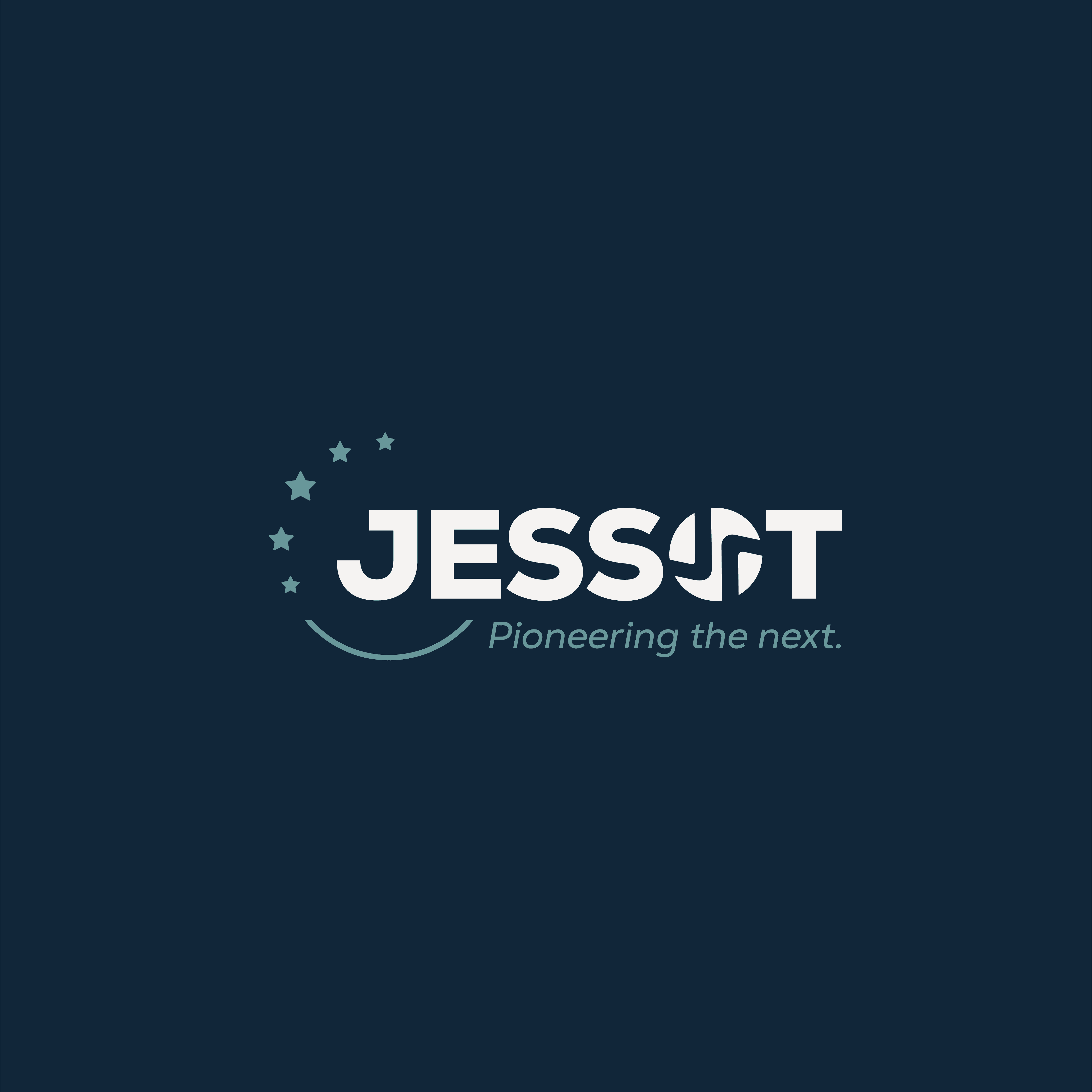
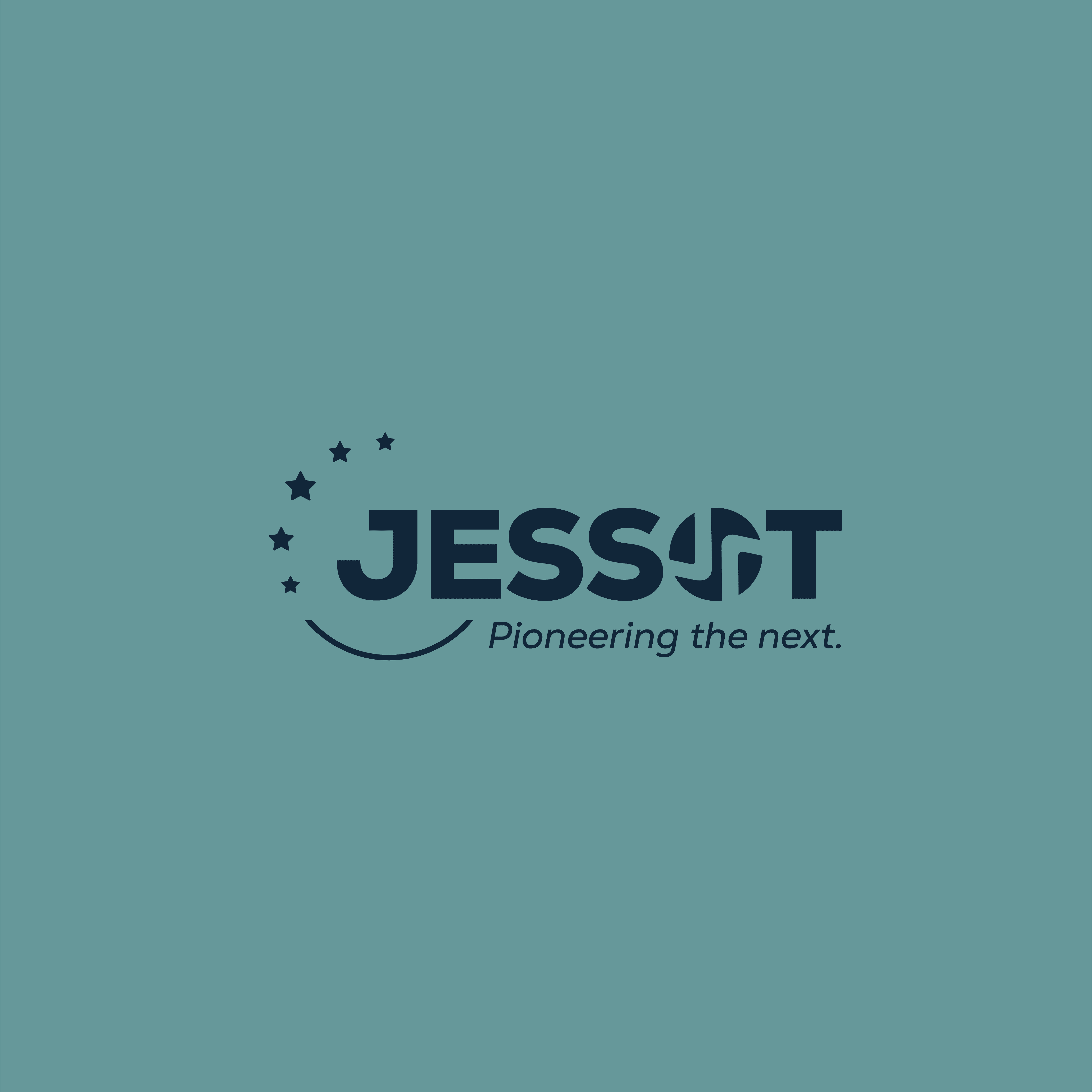
The new Jessot logotype
To ensure its visibility and impact, the Jessot wordmark is always surrounded by a minimum clear space. This area should be free of other graphic elements or text. The minimum clear space of the wordmark is a square with the same size as the width of the Jessot Symbol without the stars.
Clearance
The Jessot wordmark is clear and bold – a wordmark that is visible in almost all sizes. This gives us a range of options when it comes to size and printing technique. However, the minimum size of the wordmark should never go below 36 mm
Minimum Size
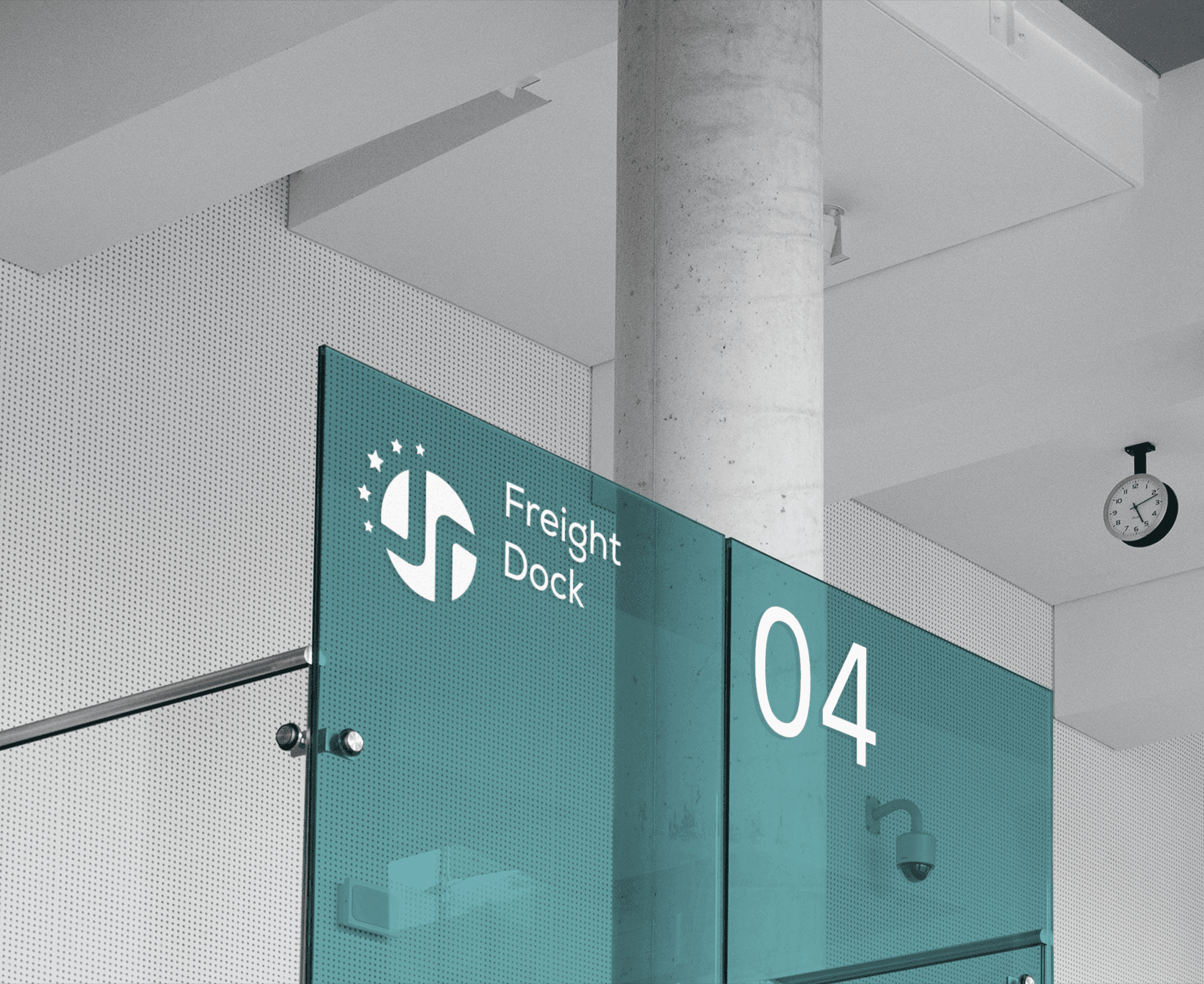
The Jessot symbol conveys quality, growth and robustness, emphasising these aspects of the brand
The Jessot Symbol


To ensure its visibility and impact, the Jessot symbol is always surrounded by a minimum clear space. This area should be free of other graphic elements or text. The minimum clear space of the symbol is a square with the same size as the width of the ‘x’ part of the symbol.
Clearance
The Jessot symbol is optimized so that it can be identically reproduced in different sizes. However, the minimum size of the symbol should never go below 12mm.
Minimum Size
The Jessot Subsidiary
Logotype

The Jessot brand colours are derived from the Jessot symbol and wordmark and effectively establish, represent and communicate the brand
Colours
A bold and unique font family, “Nexa”, has been used for a stronger and unified brand expression. The Jessot logotype is based on the typeface and the letters are specifically engineered and drawn to answer all needs.
Typography
To help highlight the different offerings of the Jessot group of companies we use a selection of patterns. The patterns can run over imagery and solid color backgrounds
Pattern


View Other Projects


