
WipeBand
Branding, Packaging and Interface Design
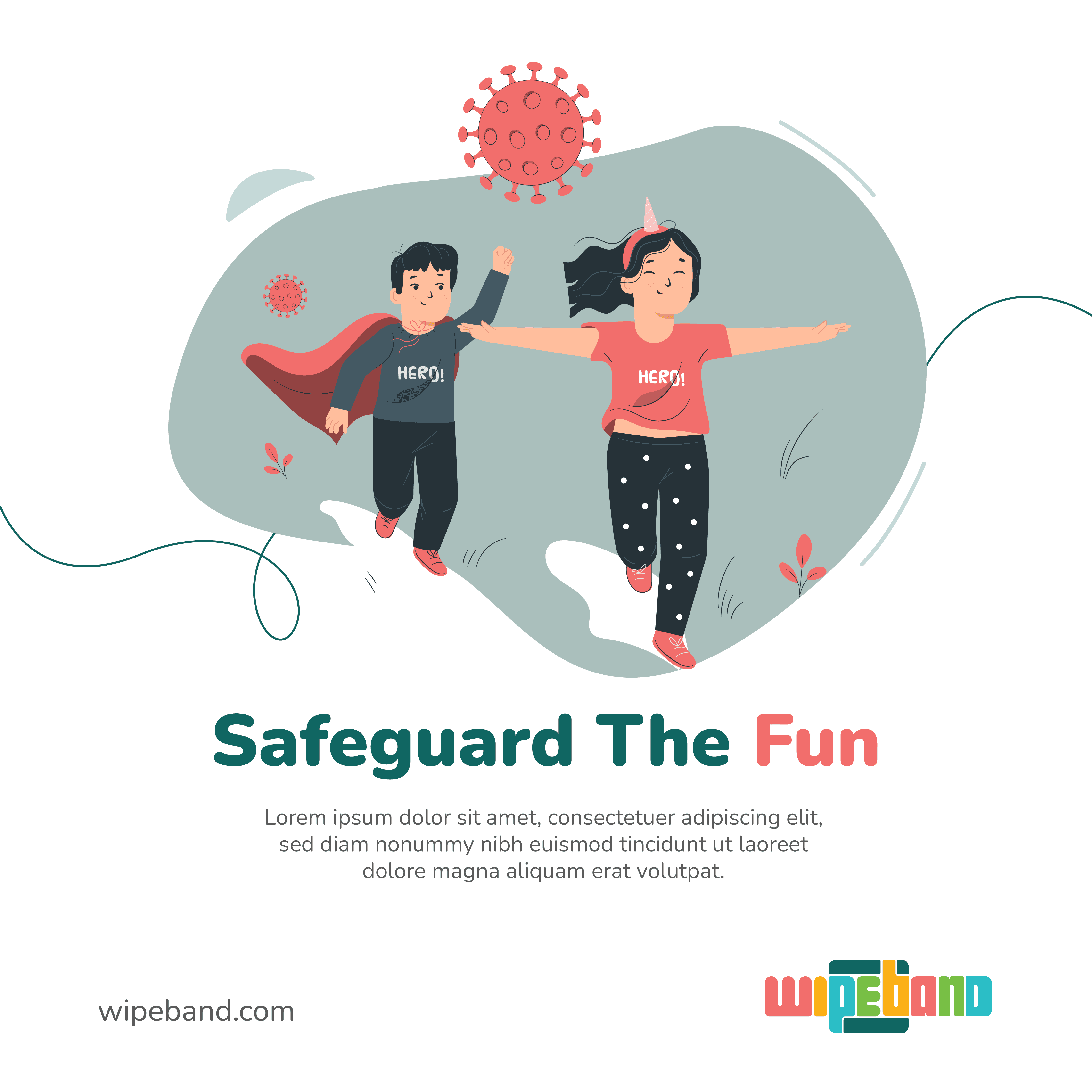
Mission
Industry Project
Project Type
Children aged 3-9 and their
parents.
Target Audience
What is WipeBand?
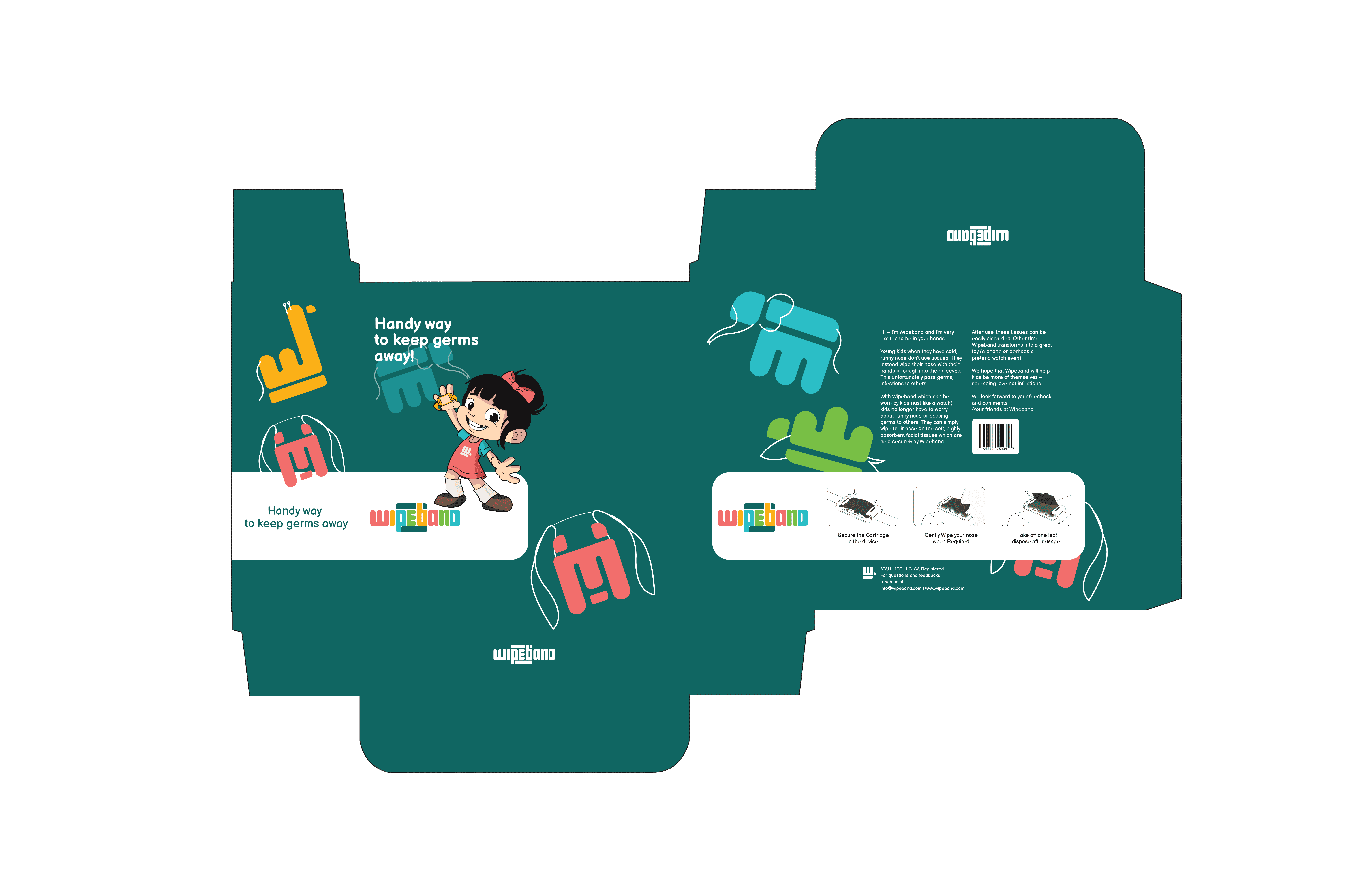
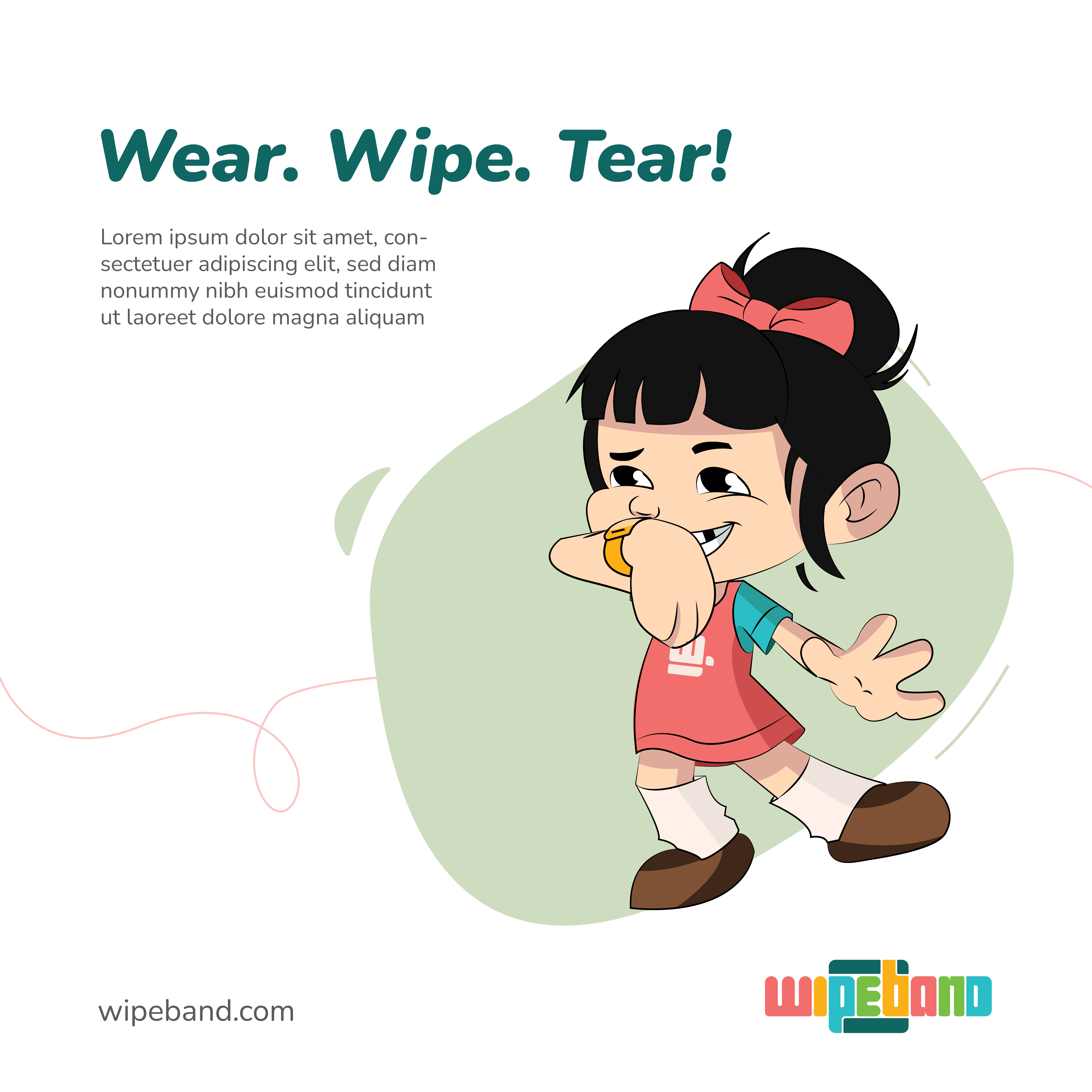
An intuitive and easy to solution to tackle cold in young children. With Wipeband, which can be worn by kids (just like a watch), kids no longer have to worry about runny nose or passing germs to others. They can simply wipe their nose on the soft, highly absorbent facial tissues which are held securely by Wipeband. After use, these tissues can be easily discarded.
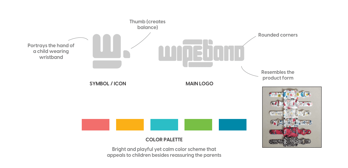


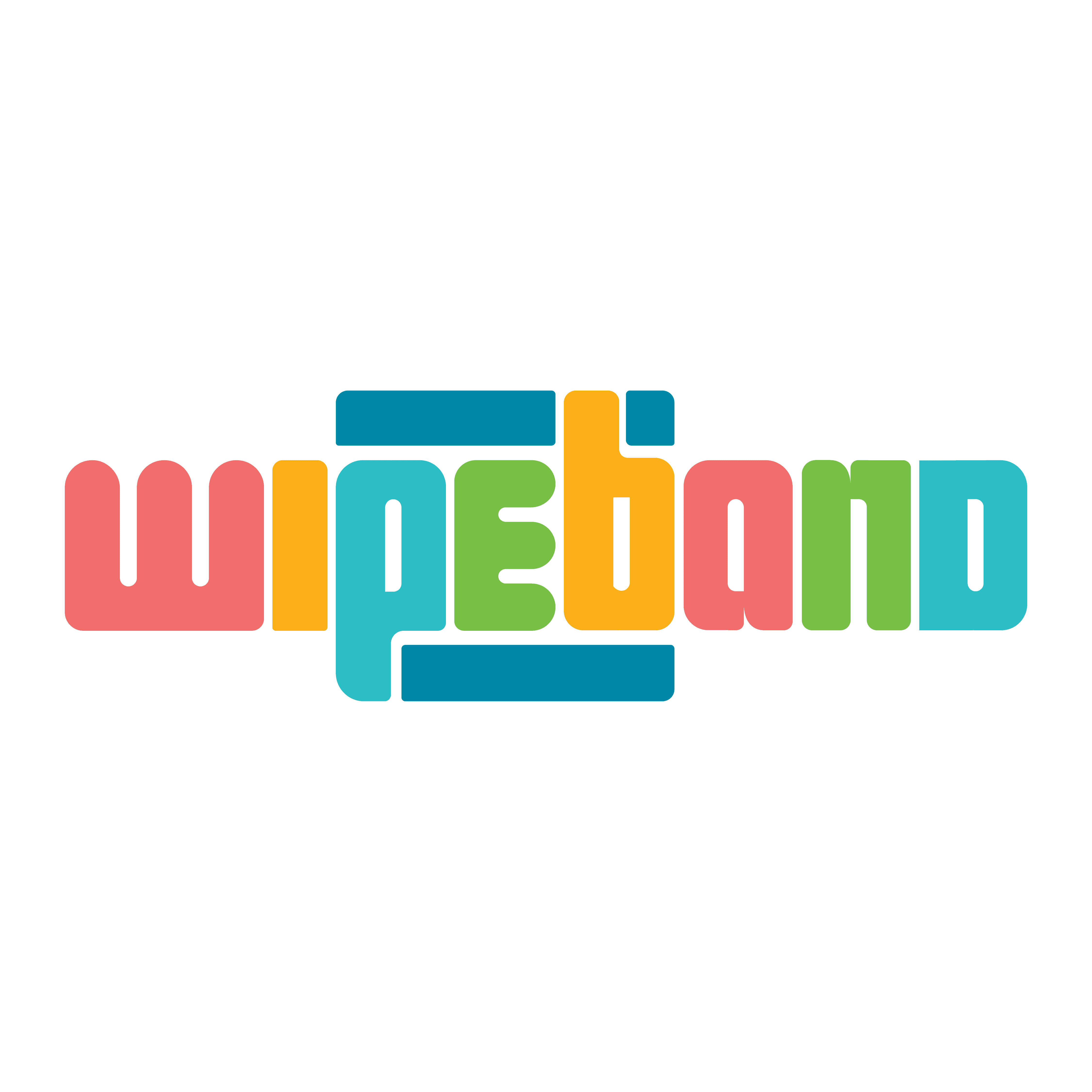
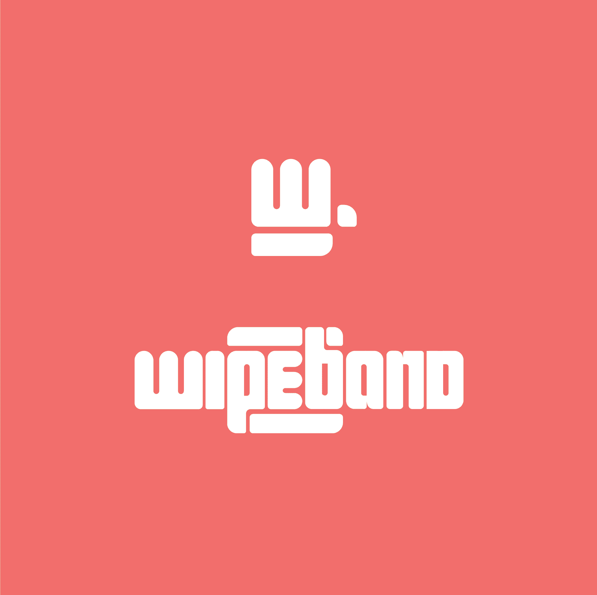
The logo of WipeBand gets its form from the actual product itself and hence is the best visual representation of the same. The symbol is inspired from the wrist of a child wearing the band, retaining the first letter 'W' at the same time.
The Logo & Symbol
I designed the surface graphics of the WipeBand packaging in a way that it appeals to the parents of young children and stands out among other childcare products.
Primary Packaging
A clip portraying the product in different views made in 3D for better visualization of the WipeBand.
Product showcase
View Other Projects


